
.png)
My client for this project was Sara Walker. Sara has a corgi named Biscuits that she treats as her child. She brings her dog everywhere she can.
The problem that Sara has identified is that she finds it difficult and time consuming to research and locate bars, restaurants, and places that are dog friendly.
The best app that does this is Yelp or Google, but both apps are unreliable and not always accurate or updated. Currently, she has to call the location to ask if her dog is allowed before she leaves.
Sara came to me to design an app where she can access this information quickly and easily all in one place that she can trust.
While discussing the goal of this app with my client Sara, we sat down and discussed our target audience and the best ways we can reach them. We identified these key demographics below:
Spot’s Spot allows dog owners to view bars, restaurants, parks, and other dog friendly places and events, while saving time sifting through other apps and eliminating the stress of wondering how accurate the information is.
Within the app, every spot is verified by the business and up to date with the necessary information.
With location access on, the app will automatically give suggested places and events closest to you.
Let’s find Spot his new favorite spot!

To start off the discovery phase of the project, I wanted to learn more about who our users are and how we can better fulfill their desires while using our app.
Because if we're not building our products for the user, why are we building them?
I conducted a survey using Google Forms to gather demographic information and ask a few questions about how they spend their time in the digital and real world.
Below I have compiled the key insights I have found, which will dictate the hows and whys of my next steps in building this product:


From the survey data that I acquired, I composed this user persona of our target user.
Meet Jessica.
She is a 27-year-old receptionist living in Portland, OR. She is an extrovert with a heart of gold and lust for adventure.

To better understand the parameters of this project and how we can reach our goals, I brainstormed how we might be able to delight our users and eliminate any gray areas or misinformation with the client.
Keeping our user Jessica in mind, I started jotting down any and all ways our app can help our users accomplish their goals and eliminate any frustrations they might have.


From there I created a journey map to show what steps Jessica will take-- from downloading our app to sitting down at the restaurant table.

This empathy map helps to better understand what motivates Jessica, using all four senses. We can also better understand what her current pains are with finding a dog friendly location and what she will gain by using our app.

Now that we have a better understanding of who our target audience is, we can move on to creating our information architecture.


This exercise was done to make quick iterations of how the UI of the app will look and perform. I set a timer for 8 minutes and once the timer went off, I moved onto the next rectangle to create a new rough design.

This exercise was done to make quick iterations of how the UI of the app will look and perform. I set a timer for 8 minutes and once the timer went off, I moved onto the next rectangle to create a new rough design.

Similar to the Journey Map, this Storyboard shows how Jessica will use our app and the processes she will take to complete a set of tasks and arrive at her desired location.

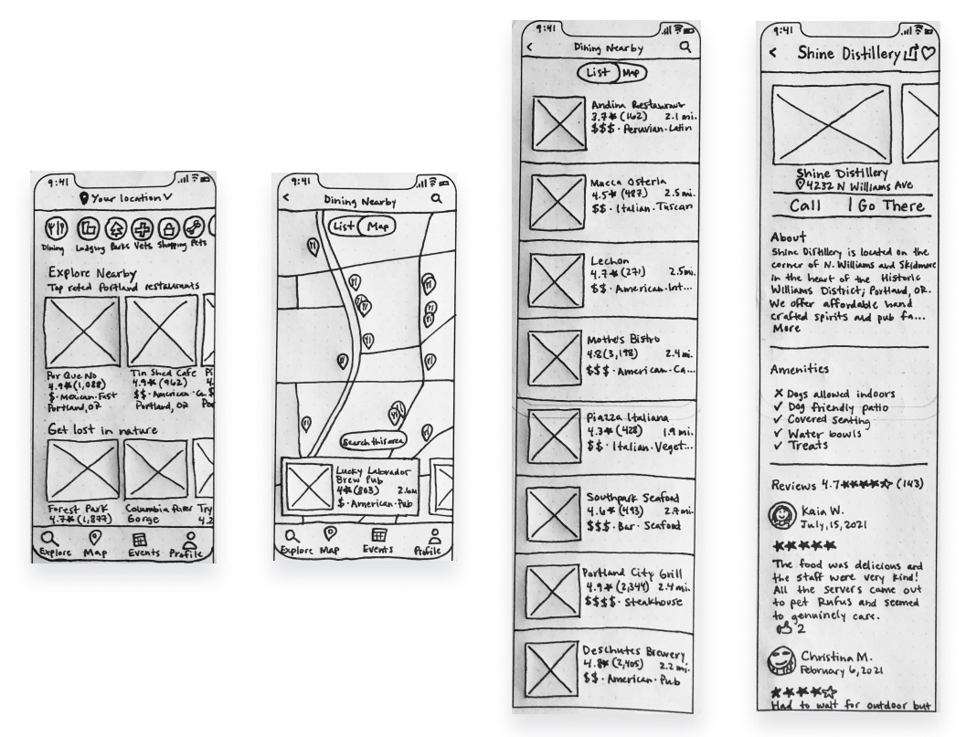
Gathering the ideas I came up with for the Crazy 8s and Solution Sketch, I created this life-size paper prototype, without any styling or color.
This method allowed me to quickly iterate and not get hung up on any details since it is only pen and paper.
And now to put our designs to the test!
I tested my paper prototype with four participants. The prototype was able to scroll up and down and when a user clicked on an area, I would swap it out for the next screen.

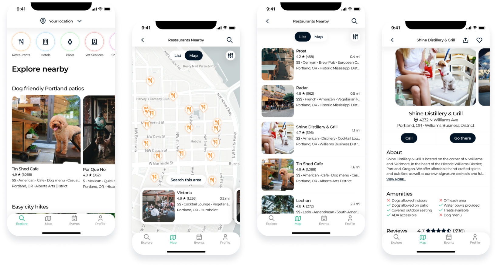
Taking the feedback I received from my paper prototype into account, I moved on to creating my first high fidelity prototype for Spot's Spot.
To keep everything clean and accessible, I stuck to mainly black and dark blue elements with white and gray backgrounds and shadows.
Once I ironed out all the kinks and had my prototype in a place that I was happy with, I moved on to user testing.
For this phase of research, I used Maze as my user testing tool. This allowed me to easily compile and make sense of the data I received.
I tested 25 participants remotely and Spot's Spot received an overall usability score of 88%.

I asked the users to complete a 5-second test to see if they could identify the app based off a screenshot of the home page.

Once the participants got to the interactive prototype, I asked them to complete a set of tasks. The first task was to "find the map of nearby restaurants."

Task #2 was to "find the list view of nearby restaurants" (from the map view).

The next task was to "find the details page of Shine Distillery & Grill."

After the tasks were completed, I asked the participants how intuitive the screens were to find.

The final question in my usability test was if any of the tasks made them feel confused or anxious and if so, why?
I was very grateful to have the 25 participants that I did because it gave me a great deal of quantitative data.

What Went Right
Lessons Learned
What Went Wrong
Actions

